

The Legend of Zelda: Ocarina of Time remake is bringing a familiar modern Zelda option to an older adventure: a way to play with almost none of the usual interface on screen. Standard, Pro, and Master settings were available during a recent hands-on preview. Footage shared by creators shows how different Hyrule Field can look when the readouts are switched off.
Retro Context
Ocarina of Time belongs to an earlier point in the series’ 3D history, when the interface helped keep essential information close at hand. Its Standard setting follows that familiar approach, showing details such as health, magic, the equipped item, a minimap, and information relevant to the situation. The remake’s other settings let players adjust how much of that guidance they see.
The stripped-back idea has a recent Zelda precedent. Breath of the Wild and Tears of the Kingdom included a no-UI option, and the remake carries that choice into Ocarina of Time. It also speaks to a broader change in how the series handles guidance: later 3D entries such as Twilight Princess and Skyward Sword were often associated with frequent prompts, while Breath of the Wild loosened the reins. The remake’s options leave room for players to choose their preferred balance.
Why It Matters
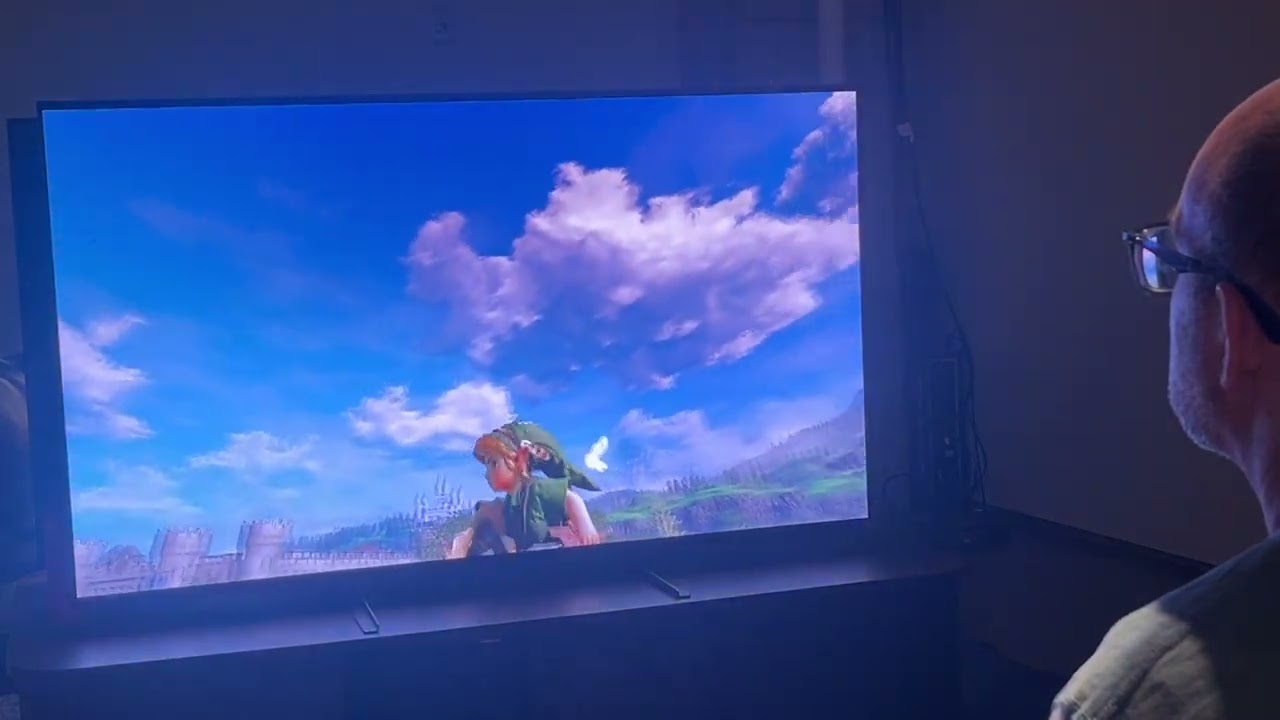
Pro mode removes nearly all informational readouts, even the health meter. It does not make the screen completely silent: save notifications can still appear, as can occasional dialogue pop-ups within the world. That distinction matters for anyone hoping for a completely uninterrupted picture. The mode reduces the persistent interface, while retaining some messages the game uses to communicate what is happening.
For returning players, a clean screen may make familiar places feel less crowded and invite more attention to the game world itself. For newcomers, losing health and other indicators could make it harder to check their status at a glance. Standard remains available for the fuller set of readouts, so players can pick the amount of information that suits them rather than treating one setting as the only right way to play.
There is also a small historical wrinkle in bringing a lighter touch to this particular adventure. The original game introduced Navi, a guide character remembered for frequent tutorial prompts. The interface setting alone does not tell us how Navi’s role or dialogue has changed, so it would be premature to assume that every form of guidance has been reduced. The available footage establishes what happens to the on-screen indicators, not every detail of the remake’s tutorials.
Z-retro View
The strongest part of this feature is the choice it offers. Ocarina of Time’s classic readouts are useful context for a long adventure, while Pro mode gives experienced players a way to clear visual space. The surviving save notices and dialogue also show that a minimal interface still has limits. It is a thoughtful bridge between the game’s original presentation and a newer preference for less guidance, with the final feel depending on which setting each player selects.
The remake has also been reported to include new sidequests, harder minigames, and subtle dungeon changes. Those are separate parts of the package, but they help explain why interface choices may matter: familiar adventures can be adjusted in more than one way. For now, the preview footage offers a concrete look at the three menu options, while leaving some questions about the details of Master mode and the full extent of other changes open.